EDSS 2906 – Teaching Geographical Skills
EDSS 2906 – Teaching Geographical Skills
Statistical maps and diagrams in Geography
Assignment 1 –Statistical Representation of Geographic Data (20%) Date due: Sunday 07th February 2021 by 23:55.
INSTRUCTIONS: You are to answer ALL questions in this assignment.
1. Using Table 1
a. Calculate the following descriptive statistics for the period 2000-2012.
i. The range in visitor numbers (1 mark)
ii. The mean number of visitors (2 marks)
b. Draw a simple bar graph showing visitor arrivals for the Carnival Periods, 2000-2012.
(6 marks)
Note: The graph must be hand drawn on graph paper, scanned and inserted into the assignment and uploaded as a.pdf doc. Do not use Excel to plot the graph.
Mark allocation:
• Correct units and intervals on y-axis - 1 mark
• Correct units on x axis – 1 mark
• Title – 1 mark
• Legend – 1 mark
• Accuracy – 1 mark
• Visually Appealing – 1 mark
| Year Number of Visitors 2000 42,646 2001 35,221 2002 33,487 2003 38,537 2004 40,455 2005 41,995 2006 42,868 2007 37,258 2008 39,115 2009 36,643 2010 37,150 2011 36,280 2012 38,252 |
Table 1. Visitor Arrivals for Carnival Periods 2000-2012 (http://cso.planning.gov.tt/content/visitor- arrivals-carnival-periods-2000-2012)
2. Draw a pie chart showing tourist arrivals into Trinidad and Tobago, 2002 from Caricom countries.
(6 marks) Table 2. Tourist arrivals from Caricom countries into Trinidad and Tobago, 2002.
| Source/Reasons for visit | Visiting Friends | Beach/Vacation | Business/ Convention | Honeymoon/ Wedding | Study | Other | Total |
| Caricom | 589 | 559 | 756 | 29 | 14 | 422 | 2,369 |
Note: The diagram must have a title, show arrival in percentage (not with actual figures), a key or legend, be accurate. All calculations must be shown. Do not use Excel to plot the chart.
Mark allocation:
| • • • • • | Calculation shown – 2 marks. No marks awarded for calculation if inaccurate. Title – 1 mark Legend – 1 mark Accuracy – 1 mark Visually Appealing – 1 mark | |
| 3. | Why are line and bar graphs commonly used to represent climatic data? | (3 marks) |
| 4. | Using the map provided for multidimensional poverty (2006) in Trinidad and Tobago, a. Complete the table b. Name the administrative areas with: - i. The highest percentage of population in multidimensional poverty | (4marks) (2 marks) |
| ii. The lowest percentage of population in multidimensional poverty. | (2 marks) |
| Administrative area Percentage (%) of population in multidimensional poverty Administrative area Percentage (%) of population in multidimensional poverty Sangre Grande Point Fortin Princes Town Chaguanas Mayaro-Rio Claro Siparia Penal/Debe Diego Martin San Juan/ Laventille Tobago Couva/Tabaquite/Talparo San Fernando Arima Port of Spain Tunapuna/Piarco |
Table 3 : Percentage (%) of population in multidimensional poverty by Administrative area
c. Calculate the mode and name one administrative area that contains the mode. (2 marks)
d. Calculate the median of the percentage of population in multidimensional poverty in Trinidad and
Tobago. (2 marks)
e. Calculate the mean of the percentage of population in multidimensional poverty in Trinidad and
Tobago. (2 marks)
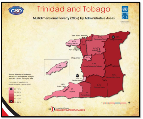
Figure 1: Percentage of population in multidimensional poverty (2006) by Administrative areas, Trinidad and Tobago.(http://www.planning.gov.tt/sites/default/files/content/mediacentre/documents/Human_Developme nt_Atlas.pdf
5. A class recently conducted a river study to determine whether there is a relationship between downstream distance and particle shape. They calculated the Cailleux Index (degree of roundness) for a sample of 40 pebbles at one site. The results are shown in the following table.
Table 4: Cailleux Roundness Index
| Pebble # | Size (mm) | Pebble # | Size (mm) |
| 1 | 220 | 21 | 240 |
| 2 | 580 | 22 | 865 |
| 3 | 200 | 23 | 345 |
| 4 | 620 | 24 | 880 |
| 5 | 730 | 25 | 315 |
| 6 | 980 | 26 | 730 |
| 7 | 550 | 27 | 280 |
| 8 | 672 | 28 | 660 |
| 9 | 350 | 29 | 440 |
| 10 | 420 | 30 | 730 |
| 11 | 210 | 31 | 290 |
| 12 | 780 | 32 | 850 |
| 13 | 205 | 33 | 920 |
| 14 | 850 | 34 | 910 |
| 15 | 730 | 35 | 700 |
| 16 | 260 | 36 | 245 |
| 17 | 600 | 37 | 275 |
| 18 | 940 | 38 | 320 |
| 19 | 710 | 39 | 510 |
| 20 | 505 | 40 | 490 |
a. Draw a histogram showing the above data. Note: The graph must be hand drawn on graph paper, scanned and inserted into the assignment and uploaded as a.pdf doc. Do not use Excel to plot the graph. Show working (7 marks)
Mark allocation:
• Calculation – 2 marks
• Correct units and intervals on y-axis - 1 mark
• Correct units on x axis – 1 mark
• Title – 1 mark
• Accuracy – 1 mark
• Visually Appealing – 1 mark
b. Calculate the following descriptive statistics for the pebble size
i. The range (2 marks) ii. The average or mean (2 marks) iii. The mode (2 marks) iv. The median (2 marks)
v. Insert the location of the median and the mode in the histogram. In which class does the mean lie? (2 marks)
Total: 50 marks